Sunday, 16 October 2016

Additional Work - High Key & Low Key Lighting

High Key Lighting

The lighting shows off the characters face and props very clearly making it easier for the audience to see. The lightning hits the characters face implying he is pain. This also results in being the main focus of the shot.


Low Key Lighting

The lighting in this scene is presented as a spotlight. This helps us to notice the main thing that the director wanted us to see. In the picture we can see a man standing in the doorway looking up. Only his body is in the light which may connote that he has been found and there's no point in escaping. Furthermore, because he is looking up in the dark it can represent him being in an unpleasant place.


High Key Lighting 


The lighting makes the scene more realistic. Also it helps the audience see all the chains that the characters are wearing, so they can be more aware of the details. Also the lighting is quite bright and in contrast showing off the colour of their clothing.


Low Key Lighting

The images shows a big contrast. This creates a mysterious atmosphere and connotes that something bad is about to happen. This is due to the fact that the women is in the light and the man in the dark. That can also represent the man being the villain due to him being in the darkness. It can represent the women as innocent due to her being in the light.

High Key Lighting 

The lighting is effective as it shows of the characters emotions as it is hitting the characters faces. The lighting looks natural as it seems, as it is coming from the window due to the shadows on the characters clothing. We can tell that the dad character is quite nervous and the son is ashamed as he is looking down.


Low Key Lighting 

The back lighting is hitting on them causing a shadow on half of the characters face. This causes the setting to be more mysterious as we do not really know what it is. Also the back lighting causes a halo effect resulting in the scene being more mystical.


Additional Work - Camera Angles

Camera Angles


This is an over the shoulder shot. This shot allows us to see how people react in a conversation as it normally cuts between the two people speaking. In this shot we can see that the character of Katniss looking quite upset due to the frown on her face. This may be because of her sister, which looks much younger due to her braided hair. 
The only prop we can see in the background is a radiator, furthermore the room is very dark. This may connote that they are not very wealthy due to the darkness in the room. It causes the facial expression of the character to be more effective, as we can tell that it is very hard for her to keep her and her sister in a positive mood.


This is an establishing shot. The shot allows us to see an overview of the setting. It could also show of the characters clothing, which may give us more information about their personality. In this shot the setting looks very futuristic, due to the modern skyscrapers. We can see a silhouette of the character. The main thing that stands out are the arrows which may imply she is quite aggressive.

Due to the setting being very modern we could say that the
  setting of the whole movie might be in another universe or in the future. It
  causes our view of the character to change in a positive way as her skills
  will be more advanced. Also the technology and weapons must be more advanced.


This is a medium shot. It shows of some of the characters actions. In this example the character of Katniss is hunting for animals. We know this due to her using a bow and arrow and focusing as if she is aiming at something. Furthermore, it shows us a bit of the setting, which in this case is a forest.


Friday, 14 October 2016

Additional Work - Mise en scène: Costume, actors, make-up, setting

Settings & Props

The Big Bang Theory
The scene is set in a kitchen, this is due to the fact that the kitchen is a social place as normally the whole family; friends in this picture visit it. Most conversations also happen in this setting. It also causes a very casual atmosphere. The scene is most likely set in the afternoon just before a party, as it is quite light in the room, and the characters are drinking. I know this because there are alcohol bottles in the scene. The women is making the cocktail which shows off the social norms.The alcohol links to the 5 young adults as it represents them as immature and that they just want to have fun. This can fit into the genre of comedy as people normally do silly things after alcohol. Also we can see that the female character is wearing a flower patterned dress. This emphasis her feminine side and it shows her as a stereotypical girl. This is because skirts and dresses are associated with females. Also the dress looks quite dressy and revealing. This adds to the stereotype that women need to show more skin to get attention from men. Also the men are al l wearing casual clothing. This connotes that they don’t really care and don’t have to dress up for attention. This links to the comedy genre as it basis itself on heavy stereotypes.  


The Missouri Breaks

The scene is set in a desert which implies that it is most likely the western genre. Also the characters that are present in the shot are all cowboys which is a convention of the estern genre. The men are all wearing cowboy hats and have a gun belt around their waist. This suggest that the characters are quite aggressive. This fits into the genre as there are a lot of gunshot outs . Also this is the stereotypical clothing a cowboy would wear. Furthermore, the narrative will most likely be quite adventures.


 Costume, Hair & Make Up


The 2 main males in the shot are young adults. The character on the right is dressed very casually in a plain green t-shirt and maroon hoodie. This connotes that he isn’t too bothered about what he wears and wants to be comfortable. The male on the left looks a little older. He has quite long brown hair which is a bit scruffy. He is wearing a check red shirt and on top a jean jacket. This makes him seem more rebellious.


Facial Expressions & Body Language

The male on the left looks very determined and forward. This is due to his body being leant forward. This can also connote him being confident in what he believes. His facial expression is quite serious. This may imply that the message he is trying to put across is important. The young male on the right looks quite nervous. I know this due to him looking down and not making eye contact with the other character. This can also imply that he is quite timid. The fact that he is fiddling with a pen suggests that he is nervous. He is trying to take his attention onto something else. 

Costume, Hair & Make Up

The main focus of the picture is the male standing up. He is dressed very smartly. He is wearing a uniform which connotes that he has an important role in society. The man at the back protesting is also wearing a uniform however its different. This connotes that he is on the opposition.

Facial Expressions & Body Language

The posture of the male standing up is very upright. This shows that he is serious. His hands are together which may show that he is quite nervous. However, it may also connotes that he is very passionate about the topic he is speaking about. The male behind him is protesting. We can tell this by his hand being up pointing to the man in front in a stern way. We can also tell he is a bit irritated due to his screwed facial expression.

Costume, Hair & Make Up

 The young boy that is facing the camera is wearing what looks like an old white t shirt. This may connote that his family is not that rich to be able to buy him new clothing.

Facial Expressions & Body Language

The young boys character looks quite confused due to his eyes being narrow and how is looking at the older male character in a weird way. This may connote that the older character has just told him something that he might not understand. We can see the older character kind off smiling at the boy. This can represent that they are relatives or that they know each other quite well.  

Sunday, 9 October 2016

Additional Work - Representation In Pop Magazines


Most pop stars nowadays are represented as money hungry and some very scandalous. A large amount of them do not have a good reputation as the media shines a bad light on them.


The artists on the first magazine cover are a boy band called 'One Direction'. One Direction is a manufactured boy band however, they have been put together on a reality TV show " X Factor UK". They are all British attractive boys (except Nial as he is Irish). The shot of them is a long shot to show off their whole outfit. They are all wearing quite casual clothing which represents them as normal teenagers and not celebrities so they are more relatable to their younger audience. They all look very happy which connotes their teamwork and bond. This is quite stereotypical I believe they are archetype. This is due to the fact that their songs are quite cheesy. Also, they are all very "pretty". This is due to the fact that their target audience is quite young. They are also mostly girls that are in education. Lastly only one of them can play an instrument properly.

They have been represented in a positive way. They all look proper and happy. They are represented in this way as they are popular to the young girls. That is why are shown as innocent and good. If they were represented in a negative way, covered in tattoos, parents of their target audience would be against their children listening to their music. This is because they would think that they are a bad influence on their children.


The artist on the second magazine cover is a male artist called ' Justin Bieber'. Justin Bieber is also quite stereotypical as he is a attractive Canadian young adult. He was found on the social media site "YouTube" by his manager Scooter Braun.  The shot of him is a medium shot. In the shot we can see his tattooed arm which connotes him being quite a bad influence as most people associate tattoos with criminals however, it can also be seen as creative. His hair is quite messy and rough carrying on the bad boy image. His facial expression is quite serious making him seem more mature. He is both an archetype and countertype. He is an archetype as he attracts a lot of girls attention due to his looks also his music is more mature now. His music changed over time as he grew up and he is not seen as childish anymore. However, he can be a countertype too as he is seen as quite rebellious in this picture. Over the years Justin Bieber was not represented too good by the media due to the actions he has done as fame was getting into his head. This happened as he was in the spotlight since a young age so he could not really go through the stage of being immature without the paparazzi following him every where. At the moment he is portrayed in a positive way as he is not getting involved in any drama and is just focusing on his tour.


Wednesday, 5 October 2016

Additional Work - Representation And Stereotypes

"Breakfast At Tiffany's" (1961)

Image result for breakfast at tiffany'sThe movie is based around a young New York socialite. The character of Holly Golightly subverts the stereotype of how women were perceived back in those days. Females normally use to live in rural areas, and be a housewife with a male breadwinner. However, Holly was a single female living in the city of New York. Women in the 1960s were expected to be conservative and only expose themselves to their husbands, but Holly is portrayed as flirty with men since the start of the film and acts as it is a natural and normal thing. The movie makes the character of Holly Golightly dominant in her relationships, which is completely contrasting the social norm of the male being in charge. 
Nowadays, women are still portrayed to be the lesser of a gender. Moreover, the social norms still have not changed as the man is the one most likely to be dominant, but there can be exceptions. Furthermore, females are also more flirty now, as I believe they have more freedom and get a full time partner later in life. This is due to them wanting to start a career. 

In the movie poster Holly Golightly is dressed in a sophisticated long black gown. This connotes her glamour and how well she carried herself as a women in those times. Also it gives her a higher status. This movie could be using the Hypodermic Needle Theory. This is due to the fact that it is trying to imply new norms for women to start thinking higher of themselves and have more confidence. It is empowering.


"Thelma & Louise" (1991)


The movie is about 2 women;  waitress and a housewife who escape from their reality. At the start both of the women are presented very stereotypically. This is due to one of them being a housewife; she has to clean, cook etc. Furthermore, the Louise is a waitress, which is a very low paid job that doesn't require skills or any hard labour.  Also at the start we can see the women obeying her husband. This has now changed as women aspire to have a well paid job and a career. Also, women are entitled to a education which results in them getting quite good paid jobs
Image result for thelma and louise poster
However, after the stereotype is subverted as Thelma & Louise decide to leave and have a vacation. At this time they are drinking and having fun - being free.

The connotations are the two of them looking very happy and pleased in the polaroid picture on the poster of the movie. This hows that they did not regret it and are having the best time ever. Also, in the trailer there is a scene of the both of them in a pub which represents them as stronger and more masculine. I believe this also links to the Hypodermic Needle Theory as it shows women that you can do anything and get out of abusive relationships. It is trying to carry a message across to the audience targeted - females.
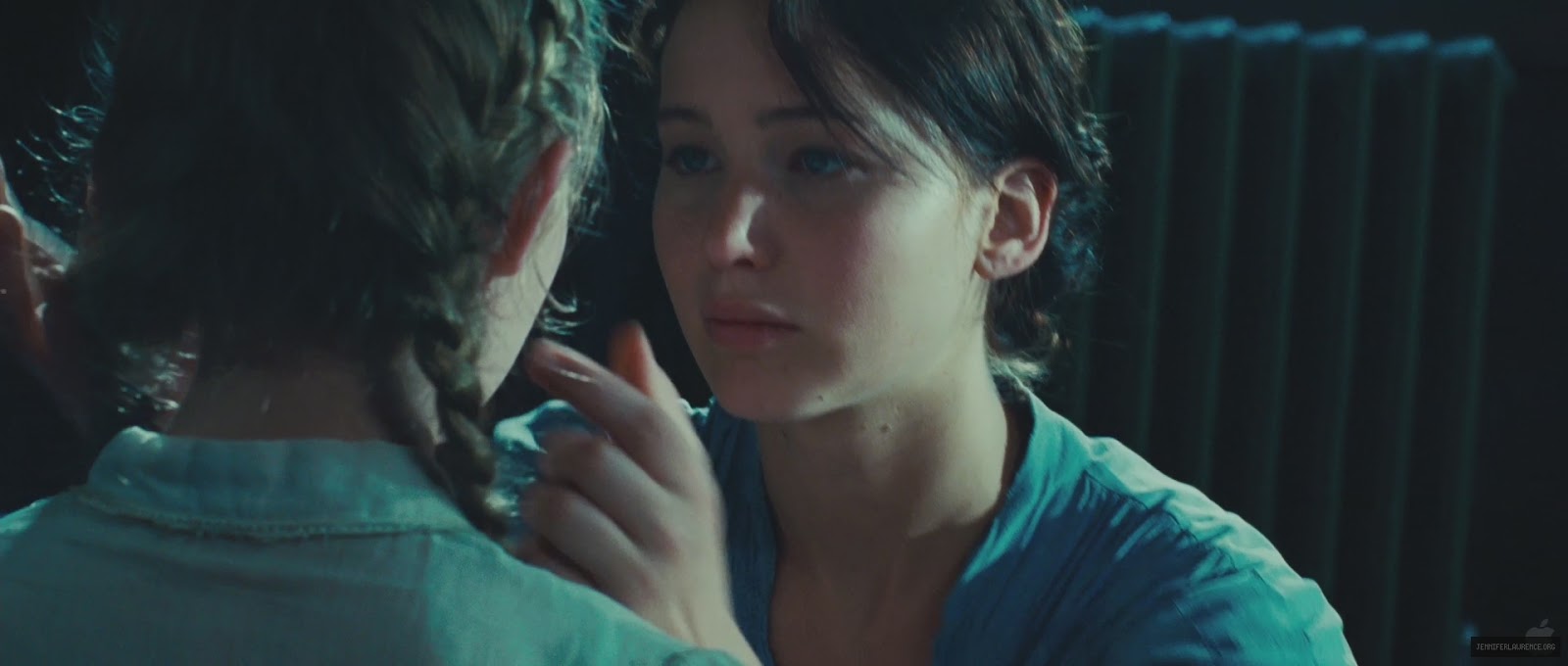

"Black Swan" (2010)


Image result for black swanThe movie is about a dancer that got her dream role in the play "Swan Lake" however, she has to battle her psychological side and rival to get through till the end. The movie represents women as quite unstable and that they can not cope with pressure. The main character "Nina" is shown as she is battling her own self due to anxiety stress and pressure. Women are still till this day represented as weak and very emotional. Women are also represented in a way that they are not good enough and have confidence and self esteem issues. Nowadays, this is still the case as a lot of women are not happy with themselves.

The main actress on the poster has a black mask on. This links to the title as it shows her as the black swan. The colour black connotes death as well as elegance and sophistication. Due to her face makeup being very pale it does hint that maybe the black swan is the other side to Nina. The theory that i believe applies to this is the Uses and Gratification Theory. I believe it applies to 2 uses and gratifications;integration and personal identity. Integration as people watching the movie will sympathize with the character due to her hardships. It could also be personal identity as the viewer might have experienced something similar to this causing them to be able to relate to it.


Sunday, 2 October 2016

Evaluation Of My Final 6th Form Magazine Cover


Evaluation

I believe that my magazine cover turned out to be quite successful. I used a wide variety of many conventions of a real magazine cover. I have used a masthead "The Sixth Voice" which is quite clear due to its size. Furthermore, I used 3 different types of typography. The first one can be seen on my masthead. The font is bold and it is similar to the American college style of writing. The text has a gradient of light to dark blue, as this was part of my colour scheme. Blue represents trust and prestige, which links to the magazine. There is a white outline to emphasises the text even more. The second type of font that I used is " Prom Special". The font is bold with swirls to show off the occasion - prom. The colour of the font is also a blue (with a purple tint) to carry on the theme. It has a black outline and a white glow to show the importance and sophistication of the occasion. The last font I used was on the quote "It was a night to remember". This font is the most swirly and feminine. It is in the colour white to stand out on the dark background and connotes perfection.

The magazine would be published every month, and be available to read/get at the sixth form base. There would most likely be a magazine comity which would be in charge of the cover and stories. However, everyone would be able to suggest ideas. A monthly distribution would be good as it can include all the important dates and events/clubs happening throughout the month. Also some of the, could be themed e.g. October - Halloween or December - Christmas.

My target audience is 6th former males and females. The masthead implies that the magazine is made for sixth formers due to the word "sixth". Also the word "Voice" suggest that they write it and have a large input of what can be found inside the magazine.

I have learnt about the basics of photoshop. At the start it was a little difficult to know how to add all the special effects but as I went on I got more comfortable with using the different tools e.g. glow,magic wand and stroke.

Throughout this task I learned how to apply my choices and ideas onto a blank photoshop canvas. Furthermore, I have learned about the conventions of a magazine and how to analyse them in a variety of examples. Thirdly, I have learnt to use different effects in photoshop which caused my cover to look better and more realistic. If I was to do this again I would add a issue number onto my cover and a skyline for it to be even more realistic. However, overall I am pleased with my final outcome.

My Finished 6th Form Magazine Cover