Tuesday, 18 April 2017
Monday, 17 April 2017
Evaluation
The media product I have created is a front cover, contents page and feature page of a pop music magazine. Throughout the production of the magazine I learned how important conventions are and the way they help structure a magazine and create the genre. My target audience is female students aged from 12-15. The purpose of the magazine is to promote new music artists and inform my target audience about the latest news from the music industry. The front cover features a new girl band which is quite conventional as pop magazines normally feature stars that are on top or very popular. For example the recent ‘Top Of The Pops’ featured YouTube star Caspar Lee, who is very relevant to my target audience. Also on the front cover there are many teasers which revolve around celebrities and their lives. For example, ‘Zayn & Louis feud over’ this will cause the consumers to be more interested in the magazine as it would probably be one of the most talked about topics due to Zayn no longer being a part of One Direction. Also my colour scheme is very limited causing the front cover to look very neat and put together. However all the important information is highlighted. Furthermore, my masthead is bold and easily noticeable. This is conventional for a magazine cover as it allows the audience to be able to spot it from a stand. My contents page is also conventional as it is organised into different categories including news, about you, music and fashion. This allows the reader to be able to easily find what they are looking for. The double page spread includes an interview with the brand new girl band. This is a convention of a real magazine because it informs its audience of an upcoming music act. The interview gives an insight to the band's past, how and why they got into music.
My media product represents female students aged from 12-15. The layout of the front cover is a conventional ‘Z’ layout. This causes it to be easier for the audience to read it. Also they would find the colour scheme to be appealing as the colour pink connotes cuteness and joy. Also the stories are relatable to the things my target audience is interested in. For example, the new featured girl band is wearing fashionable casual clothing which relates to my target audience as they can identify with them due to their costume. Furthermore the celebrities featured are of a similar age or older. The group members are represented as quite happy and cheerful, as they are all smiling. Moreover, they are standing all close together which shows their unity and love for each other. However, they all have individual personalities which may attract a wider variety of my target audience. The representation of personalities has been made through the different body language and facial expressions of the girls. For example, the band member Mia (left side on front cover) is seen as the cute innocent individual of the group. This will allow girls who may be more shy to appeal to her and her persona. My target audience may identify with one or more of the members or another celebrity of a similar age and look up to the older ones as they are seen positive role models. Also, other features of the magazine, for example fashion may be useful to my target audience as it will be specifically aimed at them.
A media institution that can distribute my magazine could be Bauer Media as they are a global giant. Bauer Media UK has the biggest commercial digital radio audience, with over half of total Bauer Radio listening taking place via a digital device, across 19 countries. This will allow my magazine to be advertised in many different countries so the consumption rates would increase resulting in increased sales. Also the magazine will be available online at www.beatsmag.co.uk and on many social medias including Twitter. This will allow it to be accessible to my target audience around the world, therefore increasing its popularity. Furthermore, due to the development of Web 2.0 the website would be more interactive and will allow the viewers of it to participate in polls, share pictures and interact more with the website (zoom on photos).Web 2.0 is quite important for this age group as they are use to the new technology and it is expected for a website to be interactive so my audience is interested in it.
The target audience for my magazine are females aged 12-15. They are most likely interested in the latest gossip so they will be interested in the content of the magazine. Also they will be interested in the newest albums and trends going on. My demographic will be secondary school students. However, I believe that other females which are interested in the music industry and its celebrities.
As my audience are mostly students under 16 it means that they are unable to earn money, so this is why the price of the magazine is quite low at £1.99, so they are able to afford it. The magazine's content would also attract my target audience as the content is relevant to their interests e.g. celebrity gossip, new music that came out. Furthermore, the house style of the colour scheme of pink and white through the magazine causes, the magazine to be more appealing to my audience. Moreover, the language that is used is applies to my target audience as it is the restricted language code. Due to this the target audience will find it easier to read the magazine and relate to it. The magazine is also easier to read as my target audience doesn't really like to read a lot of heavy paragraphs due to their short attention span. A lot of my knowledge about my target audience has originated from my market research. The findings allowed me to chose the most appealing colour scheme and price. Furthermore, it gave me an insight to what types of layouts are the easiest to follow and what will interest my audience most.
Since the start of the project I learnt quite a lot about new technologies and undertook many different roles. When I was taking photos for my magazine (took on the role of a photographer) I learned how to set up the lights and experimented with coloured filters on the lights. I didn't use any of the photos with the filter as I didn't think it looked natural so it wouldn't appeal that much to my target audience. Next, when the photos were all taken I learned new features and functions of photoshop. For example I learned how to edit a photo; getting rid of red eyes, removing blemishes. This is an example of the role of an editor. Furthermore I learnt about the proliferation of hardware and how devices now are much cheaper and efficient.
Since the preliminary task I feel like I massively improved my skills and knowledge of the print media industry. I improved my design skills; spacing images and text across the page. I also improved my improved my skills and knowledge of the print media industry. Furthermore, I believe that my research skills became of a higher quality as the information I use is more detailed and focused on my target audience and product. I conducted a lot of research to make my magazine look as realistic as possible. This research included analysing front covers, contents pages, feature pages, creating a questionnaire for my target audience to fill out, mood boards, flat plans and much more. The questionnaire gave me the most insight as I got real feedback from my target audience. The research helped me to get a better idea of what my target audience finds appealing and what is conventional for a pop magazine to look like including the typography, images and house style. Moreover, due to this I believe that my product looks more realistic and conventional.


Photoshop Developments
Photoshop developments of the front cover.

Photoshop developments of the contents page.

Photoshoot Photographs
These are some of the photographs that were taken during the photo-shoot. I will use some of them for my magazine. However, the others I will not because they are not the best due to reasons including; bad lighting, poses were not appropriate or the shadows were too visible.


Photoshoot Schedule
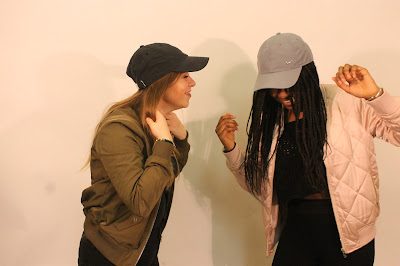
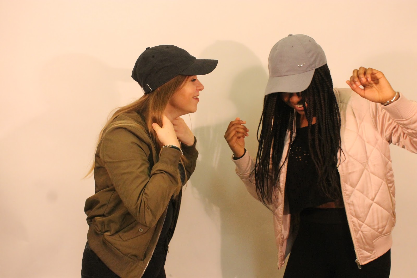
I created a photo-shoot schedule in order for me to know exactly how I want my models to pose therefore, making the photo-shoot time efficient and organised. I wanted the girls to show different personalities through their poses and facial expressions therefore I made their facial expressions all different. Also creating this schedule allowed me to know if I need any extra equipment and when and where I will be taking the photographs.
Date & Time
|
Shot/Photo Number
|
Day Or Night
|
Interior/Exterior
|
Location Or Studio
|
Models Equipment, Mise-en-scene
|
Lighting
|
21/12/16
|
1 – Front Cover
|
Day
|
Interior
|
Studio
|
Long Shot
Girl Band - 3 girls standing closely together.
1st - smiling playing with her hair.
2nd - standing casually showing some attitude. 3rd - smiling, acting quite cute.
|
Studio Lighting
|
21/12/16
|
2 – Contents Page
|
Day
|
Interior
|
Studio
|
Medium-long shot
Girl Band - 3 girls standing together
1st - hand on her hip, smiling.
2nd - hand on 1st girl shoulder, smiling.
3rd - hand on hip, smiling.
|
Studio Lighting
|
21/12/16
|
3 – Contents Page
|
Day
|
Interior
|
Studio
|
Medium-long shot
A boy with his face down and his hand going through his hair.
|
Studio Lighting
|
21/12/16
|
4 - Feature Page
|
Day
|
Interior
|
Studio
|
Long shot
Girl Band - 3 girls standing together
1st - Her jumper is falling from her shoulder, her hand is going through her hair as well as leaning it on girl 2. Her facial expression is quite seductive.
2nd - standing casually with her hand on the shoulder of girl 3. She is very smiley.
3rd - smiling, looks confident, her hand is in her pocket or tugging on jean pocket.
|
Studio Lighting
|

Flat Plans
I have created these flat plans in order for me to be able to then easily create my real magazine. This is due to the fact that I will know what goes where and it will help my time efficiency. I have created flat plans for all of my magazine pages. I made more than one for each to help me decide on which lay out looks the best and is most conventional.
Flat Plans For Front Cover


Flat Plans For Contents Page


Flat Plans For Double Page Spread


Research Analysis


The majority of my research was answered by females (60%) followed by 30% of males and 10% other. It is good that most of my questionnaire was answered by females as that is my target audience so their opinion is most valued.

Most of my questionnaire was answered by 16/17 year olds, followed by all the other age groups. This is a bit older than what I first planned my target audience to be however I believe they will have similar interests so it would still work for my magazine.
The most popular colour was pink closely followed by purple and blue. The least liked colours were green and yellow, so I will not be including them in my colour scheme.

The most appealing text was "Text 3" so I will most likely use that text for my masthead. It was followed by "Text 1" so I might use it somewhere in my magazine as my audience appealed to it. I will not be using "Text 4" as it did not appeal to my target audience at all, so if i do use it, it might put them off.

The most preferred music genre was pop (43%) which is also a positive as it gives me an insight to what my audience enjoys. The least liked genre was classical (7%), which I am not that surprised by as it is not conventional for my audience to listen to it.

Even though, most of my target audience reads a magazine once every month, they would prefer the magazine to be distributed each week. Moreover, the second most preferred time of distribution is monthly, so I will most likely stick to that one.
 The most preferred price is £1.99, followed closely by £1 or less. Due to my target audience not being employed, the price of the magazine will be quite low so it's appropriate to them.
 The most appealing layout was the T design, closely followed by the C design. I will most likely use the C layout as it is more conventional than the T layout. Also, it will allow me to place more teasers across my front cover.
The most preferred artist to read about is Ariana Grande, Justin Bieber and Little Mix. These artists are the most popular at the moment in the music industry, this is due to several different reasons; scandals, appearance and new music. Therefore I will include different types of celebrities so it applies to most of my target audience.


There was an equal divide between people who wanted the magazine to be printed and accessed digitally. Therefore, I think I will produce a print copy and a digital.
The most preferred topic to read about was celebrity gossip. I may use throughout most of my magazine. For a cover line I could use a rumour or a scandalous quote.
The majority of my audience reads a magazine once a month, so I will most likely release my magazine each month. However, 20% of my audience reads a magazine everyday and the other 20% probably reads it less often than once a month.
Thursday, 13 April 2017
Questionnaire
I designed a questionnaire for my target audience so I can get an insight to what they would like to see in my magazine. This will also help me choose what to include in the contents of it.


Bauer Media Case Study
Bauer Media
Bauer Media is a European-based privately owned media group. It was originally founded in Hamburg in 1875 and developed over time. Due to this it now operates in 19 countries. Furthermore, in the UK it reaches to over 25 consumers, through their shares with KISS, Grazia, Magic and many more.
 Bauer Media Group entered the digital era in the 1990s. This is due to the development of the internet, which relates to cross-media platforms. It is also Britain’s biggest magazine publisher. For example, the magazine Heat launched in the UK in 2000. However, now due to the development of Web 2.0 and its success, it has its own heat radio station and online website heatworld.com. This magazine is mostly aimed at a mainstream audience, however they also have alternative magazines which are targeted at a niche audience. For example, due to the gardening market growing, Bauer released a magazine titled ‘Modern Gardens’ in 2015. The magazine aimed to target audiences which want to enjoy their outdoor living space but are not necessarily experts in gardening.
Bauer’s digital business is connected through Bauer Xcel. Overall in the UK there are around 40 million users accessing Bauer's brands globally, through over 100 websites and 50 digital editions of print based brands. This allows the brand to reach to a wider target audience which may be more interested in technology rather than print. Also, many consumers nowadays expect to access what they can by print also online. This may be due to the development of Web 2.0 which is an upgraded version of Web 1.0; refers to the first stage in the World Wide Web, which was entirely made up of Web pages connected by hyperlinks. Web 2.0 allows consumers to more interactive with the website by sharing pictures, zooming in and out on photos. This causes the reader to be more interested in the website therefore the brand/product.
Representation Analysis
Are Women Sexualised In The Music Industry?


Subscribe to:
Comments (Atom)